Ensuring that the projects we make are seen by our target audience is an integral part of any production. When working within such a competitive and diverse industry, it is important to have a strong web presence to show who you are as a person or company, to pass on the right messages with your work. In this post, I will be evaluating three separate web presences and utilising these to improve my own online persona.
Rachel Maclean
Evaluation
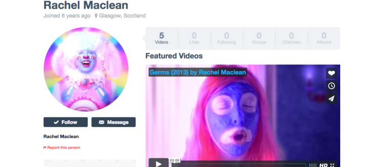
Rachel Maclean is an artist based in Glasgow. She has two main web pages to showcase her work- a tumblr blog and a Vimeo account. Her tumblr home page (click here to visit) is shown below.
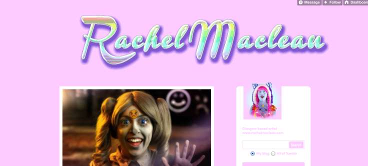
Something that instantly stood out from Maclean’s tumblr is the personality that is injected into the layout. The bright, almost garish colours are not what you would perhaps expect from a professional site, but in many ways, this makes her stand out. There is nothing corporate or usual about the presentation- it is not something that would have been seen many times before.
By using such unusual techniques, I believe that Maclean is trying to make sure anyone browsing her site knows exactly what she is all about. She is not trying to pretend she covers every single aspect in media- her interests clearly lie in the quirky and creative side of productions and it is pleasant to see something a little brave and different. It gives the impression that she took the time to make the site herself with her personality in mind, rather than just using the standard templates and neutral colours found in many websites. She still manages to cover the necessities, by showcasing her portfolio of work, having links to her social media accounts for further updates and explaining who she is and where she is based.
This site would perhaps not be looked on the most favourably by professional employers, as it does have its downfalls. The colours will not be to everyone’s tastes, and it is not particularly easy to navigate- there is one long stream of posts, but no sections or categories if you are looking for something specific. The animated glitter title and baby pink theme would be perhaps more appealing to a younger generation- or even give the impression that she herself is younger, rather than an experienced name in the media industry. However, if she is more interested in freelance work and doing her own projects with her own ideas and choices, I think it is something modern and fun. It would certainly be considered memorable, especially if you are browsing a lot of similar sites looking for someone to collaborate with.
Something that works particularly well in my opinion is the continuation between Maclean’s sites. When we visit her Vimeo page, we can see that her main video and her icon are extremely similar to the themes and images found on the tumblr blog. This creates a sense of identity- you can almost associate her with these colours and identify her by future projects to see the direction she prefers to work in.
Although I can see why not everyone would agree, Maclean’s webpages undeniably display a lot of personality. Since the industry is extremely competitive and you have to have that “niche” to be successful, I would like to think that, although risky, having such a unique online presence would work in her favour.
What can I take forward?
Something I will certainly take forward from investigating Maclean’s webpage is that not everything has to be completely impersonal. Having elements of your own personality to build your own brand can sometimes work just as well or better than trying to remain completely professional and detached from your work. The fact that the colours and themes are copied between her sites has really inspired to me to try and link all of my work in any way I can to create a brand that is memorable and most importantly, identifiable.
BBC Studio Works
Evaluation
The BBC is an extremely well-known organisation, with over sixteen thousand employees (The Guardian, 2014). Below is a screenshot of the homepage of their Studio Works site (click here to visit).
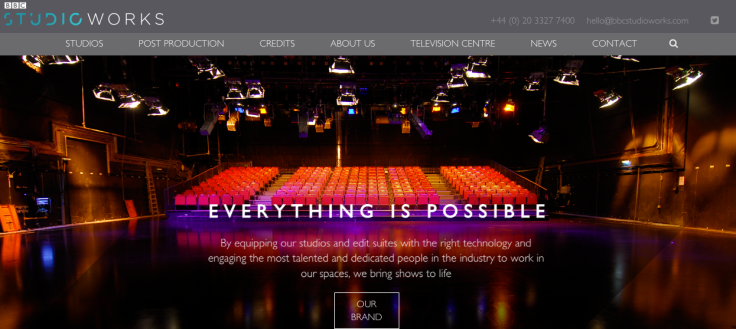 This site has clearly been formulated to represent the high standard of professionalism that would be expected from such a large and well-known company. The subtle colours and technically-savvy animations are of extremely high quality, implying that the company takes time and care with what they produce.
There are clear links to navigate the pages, with everything you would expect to see. Contact details, lists of their work and what they have achieved and even a search bar if you are looking for something specific- this ease of use creates a sense of reliability from the company. The colours found in the theme are varying shades of grey, white and blue, creating a very professional feel, which makes the viewer aware that they are dealing with an established broadcaster.
Although the site is visually impressive and fantastic to use, you could argue that it is not dissimilar to every other professional site out there. It doesn’t particularly draw your attention or express any personality- you can very much tell that it is from a corporation, which perhaps creates a lack of connection with the viewer.
However, is this really the BBC’s fault? They are already an established household name. The company does not need anything extraordinary to encourage visitors or cause a shockwave to garner more business. They need to simply upkeep their professionalism and ensure that the many people who visit their site find what they need and have a pleasant browsing experience in order to continue their popularity. If their site went against the norm, they could be accused of not taking their position seriously by having an amateurish web presence.
What can I take forward?
The BBC’s site was incredibly easy to navigate and reminded me that simplicity is key for some aspects. People need to have a clear idea of which part of your web presence they need to visit to find out who you are, how they can contact you and where they should be looking to see examples of your work. If they cannot find the appropriate points of contact, they may well give up and move onto the next site, which could reduce your presence within the industry. I will therefore ensure that all of my relevant information can be found quickly and easily, whatever form of web presence I create.
Chris Milk
Evaluation
Chris Milk is an American media artist based in Los Angeles. He has worked with a multitude of famous faces on a number of projects across many media genres. Below is a capture of his home page, at milk.co.
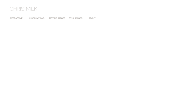
The first perception of Milk’s site is certainly how minimalistic it is. The neutral colours and blank white background seem to suggest he is trying to show a sense of strong confidence in his work and his lack of need for anything too distracting from his aims and interests. However it could be argued that the site almost looks incomplete or unfinished- some people might skip past the website if they didn’t investigate the links above, thinking it was incomplete or slow.
However, once we delve further into the links, there is a very modern look to the site, which Milk may have used in order to show that he is up date with the times and innovative in his work. The site is very polished and consistent, with no distractions in the form of bright colours or animated graphics. A good word to describe it would perhaps be ‘clean’.
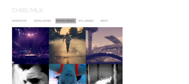
The links are self-explanatory, and direct the viewer to whatever they may be looking for. The images he uses as links to his projects are of high quality, and set the theme for the projects hidden behind them. He has a very detailed About section, which details his achievements.
I think Milk is trying to show a very strong and confident web presence. He is showing that his work does not rely on bright colours or fancy animations to be interesting. The site almost lets the work speak for itself. However, this perhaps doesn’t show a connection to the viewer- the site doesn’t contain an awful lot relating to his individual personality, but then again, it could be argued that his personality is extremely professional and work related, which is undoubtedly reflected in the site.
What can I take forward?
I greatly admire Milk’s confidence in his work and how he relies on it to carry his site forward. This presence has reminded me that I shouldn’t hide my work behind fancy graphics, or spend so much effort altering the appearance of my site that people are distracted and don’t wish to continue further. Showing personality doesn’t always mean using your favourite colour, or using images you think are pretty. Sometimes, your personality can involve high professionalism, and therefore, it is more than acceptable for your site to display that.